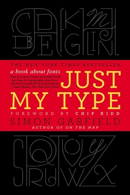
Fonts surround us every day, on street signs and buildings, on movie posters and books, and on just about every product that we buy. But where do fonts come from and why do we need so many? Who is behind the businesslike subtlety of Times New Roman, the cool detachment of Arial, or the maddening lightness of Comic Sans (and the movement to ban it)? Simon Garfield embarks on a mission to answer these questions and more, and reveal what may be the very best and worst fonts in the world.
Typefaces are now 560 years old, but we barely knew their names until about twenty years ago, when the pull-down font menus on our first computers made us all the gods of type. Beginning in the early days of Gutenberg and ending with the most adventurous digital fonts, Garfield unravels our age old obsession with the way our words look. Just My Type investigates a range of modern mysteries, including how Helvetica took over the world, what inspires the seemingly ubiquitous use of Trajan on bad movie posters, and what makes a font look presidential, male or female, American, British, German, or Jewish. From the typeface of Beatlemania to the graphic vision of the Obama campaign, fonts can signal a musical revolution or the rise of an American president. This book is a must-read for the design conscious that will forever change the way you look at the printed word.


