Victionary
product information
description
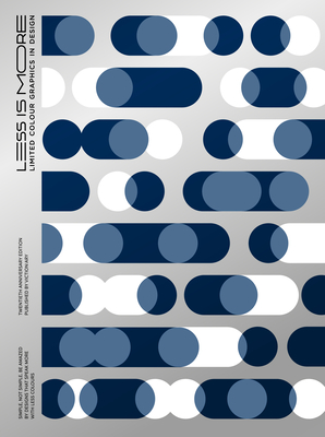
0The minimalism movement has become a mainstay in popular culture, due in no small part to the mounting pressures of modern life and the need to cut clutter. In graphic design, its principles are often applied by way of reducing the color palette used, whether it be for visual identities, publications, or exhibitions. Amid the sea of chaos in saturated spaces, simplicity can make for a truly striking statement. In conjunction with Victionary's 20th anniversary, the 2021 rerelease of Less is More features additional projects and a special cover that draws from the original look of its best-selling predecessor. It features creative solutions and visual experiments from around the world that play with thoughtful colour combinations, material applications, printing effects, and graphic details to prove that the best designs often speak more with less.
member goods
No member items were found under this heading.
Return Policy
All sales are final
Shipping
No special shipping considerations available.
Shipping fees determined at checkout.


